Ballquant
Ballquant is a series of machine learning models that predict the outcomes of live NBA matches.
With their mathematical algorithms Ballquant was producing successful predictions, but they lacked methods for delivering that value to sports bettors.
I had to craft a method in which Ballquant could achieve accessible, digestible, and useful user connections to provide predictions yielding monetary returns.
About

The Challenges
Ballquant wanted to provide simple and consistent
financial growth by using their predictive algorithms.
Ballquant aimed to: become the best shot caller, and also
be able to provide the most digestible sports betting service.
Viable Solutions
Ballquant needed a clear, concise, and
digestible interactive platform to be designed.
Ballquant would provide simple and consistent growth
through succinct notifications that were named Call Cards.

Tools and Time Used
Tools Used:
Miro, Photoshop, Adobe Xd
Project spanned 8 weeks:
February 5th - April 5th 2021
My Design Roles
▫ Research
▫ Ideation
▫ Copywriting
▫ Site Mapping
▫ Wireframing
▫ Client Management
▫ User Interface Design
Design Process

Co-Founder interviews revealed
▫ Ballquant had predictive algorithms that had been performing well with reliable results which were
able to consistently return a profit.
▫ Ballquant did not have a clear mission statement. Defining that with the Co-Founder was an important priority.
▫ The website and the responsive web application were dated and needed their experiences reconstructed.
▫ They initially posted their betting signals on a message board as a way to share value.
▫ The client had previously conducted research and gathered comparative data on competitors.
Ballquant's goals were
▫ Deliver steady, consistent financial growth to sports bettors.
▫ Become the most digestible sports betting service compared to its peers.


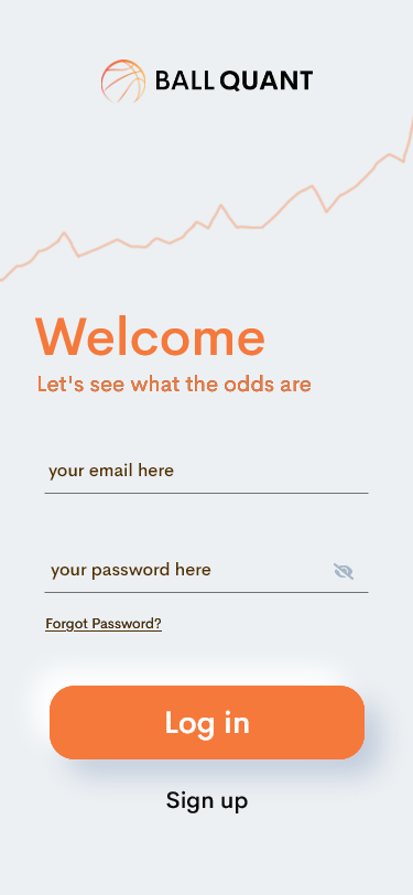
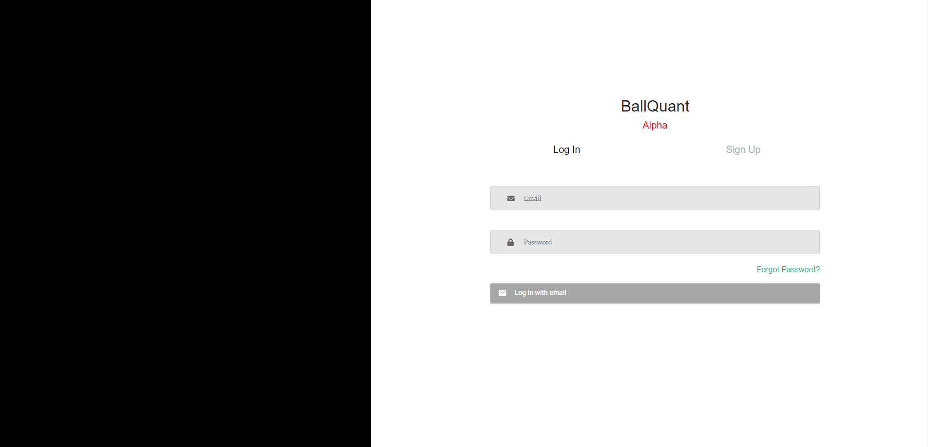
This is the old Log In page for the mobile application.
It lacked brand representation and needed better readability.
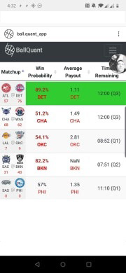
This is the old Home page for the mobile application.
Though it was simple enough, it did not have any clear call to action.

Discovering that
Use of the message board enabled user contact and we were able to
find users who had tried betting apps including Ballquant. User interviews
were conducted with 20 sports bettors total. A large majority of users
wanted quickly digestible information and less clutter.
Are Sports Betting services prone to information overload? Was
Ballquant using words and numbers succinctly?
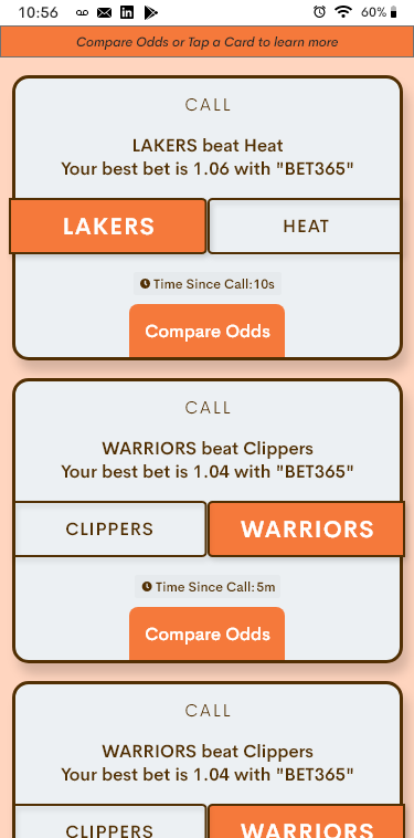
To help Ballquant achieve a valuable connection to sport bettors,
the idea of the Call Card was created. It would be a vehicle which delivers
value to users in the form of a succinct notification - with additional
options.
Below is the construction of a Call Card flow.
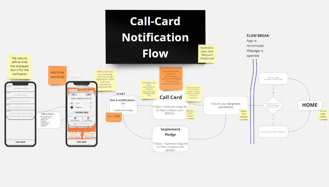
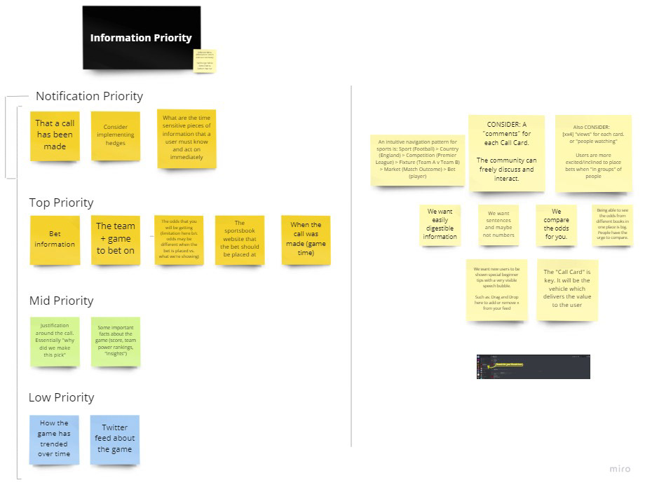
Information architecture for Call Cards was based off of
a priority card sorting exercise that I took the users through.

Starting to Build
We defined which parts of the app were necessary to build the MVP.
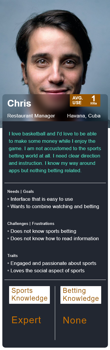
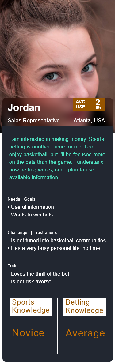
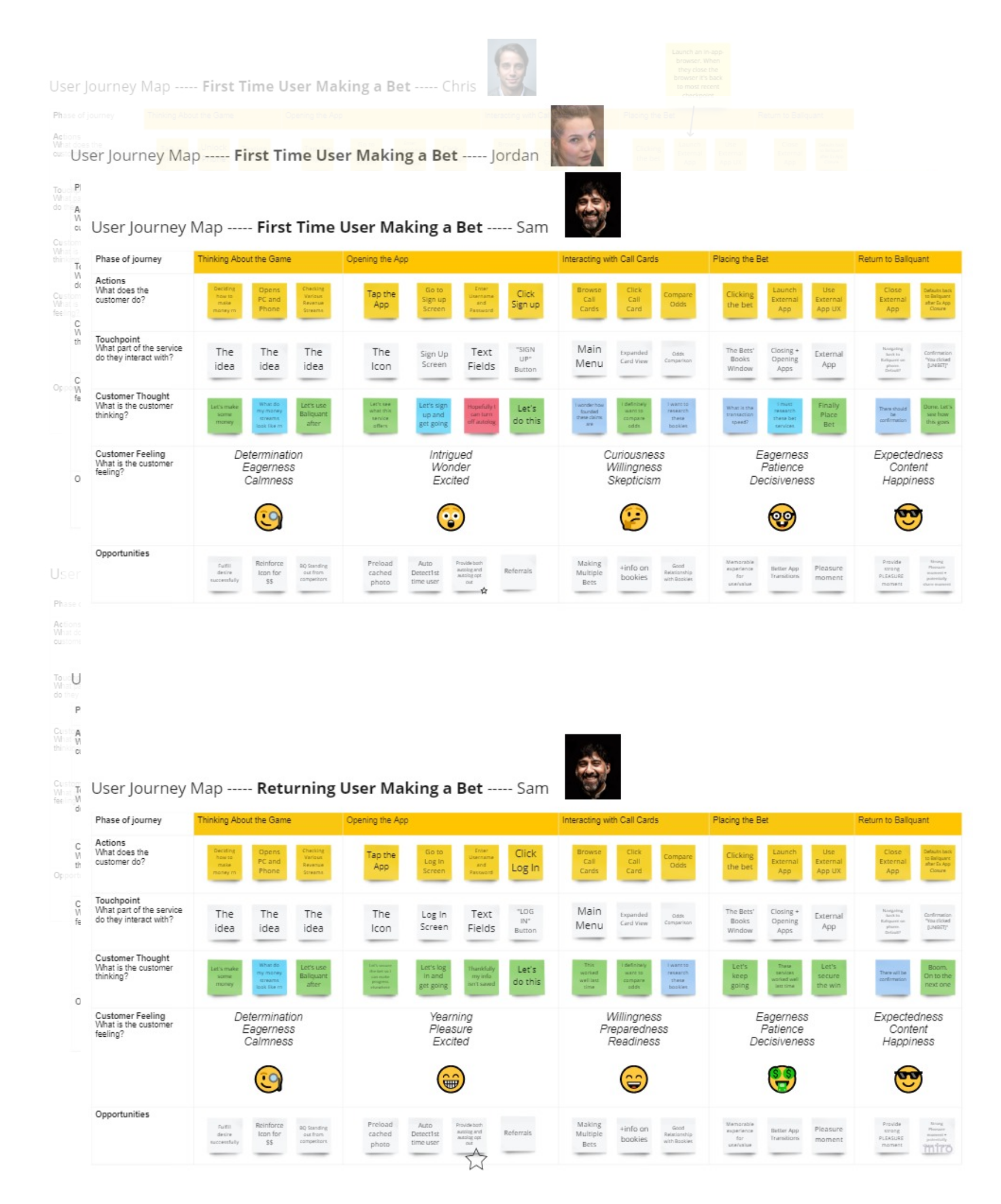
User personas were created to form reliable and realistic representations of key audience segments for reference.

User interviews were drawn upon in order to create the three user personas below.

I created journey maps based off of the user interviews to gain a holistic understanding of our user journey.
There are "First Time User Making a Bet" and "Returning User Making a Bet" journey maps for each persona.
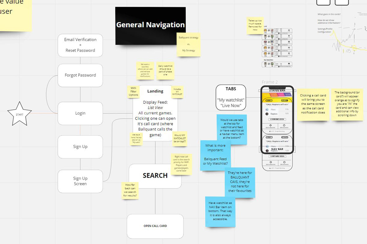
Below is an example of one iteration of site maps and design ideas. I calibrated upon each new input from the client.
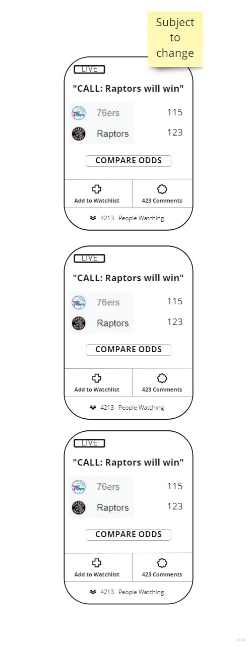
This is one of the initial iterations of what multiple Call cards would look like.
We needed all the value succinctly placed within each card with a couple extra options.
The goal here was to balance between too much information or too little information provided.
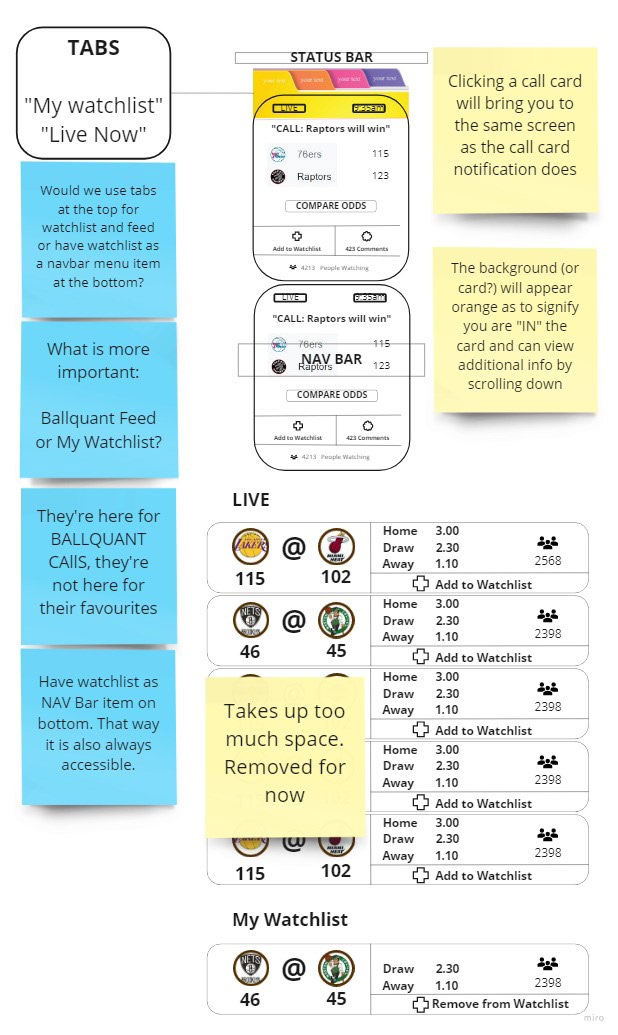
I dove deeper into the concept of compact versus expanded Call Cards,
as well as a tab feature. The ability to change the amount of information
shown created the choice of fitting more cards at once, or showing more
detail at once. The tab feature would enable simple and clear movement
between different sets of information.

Working with a Chief Technology Officer
and a Developer I delivered a
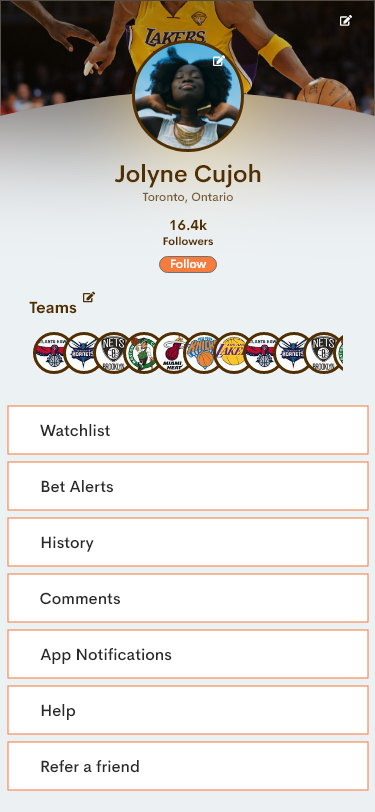
▫ Home screen
▫ Profile screen
▫ Log In screen
▫ Sign Up screen
▫ Landing screen
▫ Digestible information
▫ A means through which users obtain value
Initially I provided a basic Home page design.
By doing so I could begin to receive the input from the client.
Below are an initial Landing page and an initial Profile page.


Here is a flow example from the initial prototypes.
I delivered a requested revamp of the User Interface design.
Ballquant wanted it to feel less about money and more about sports.
I updated the typeface, the logo style, the slogan and the colours.
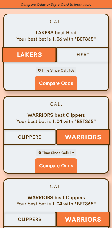
After much iteration the Call Cards were finalized.
They would be the vehicle in which Ballquant's value reaches the user.
Below we have two different instances of the Call Card.
The first image is of collapsed Call Cards. The second image is of an expanded Call Card.
After further iterations I had final copies ready.
Here is an video of some final screens.
Using the Call Card Ballquant could achieve a valuable connection to
sports bettors, and help users benefit financially with betting predictions.
Ballquant had approved the design.
I handed off CSS code to the developer.
Design verification testing was done to ensure the UI was consistent and accessible.
Ballquant is currently working on the design as part of the 2.0 developments and launch.
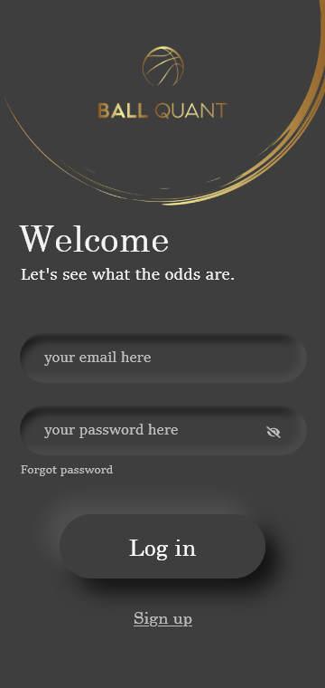
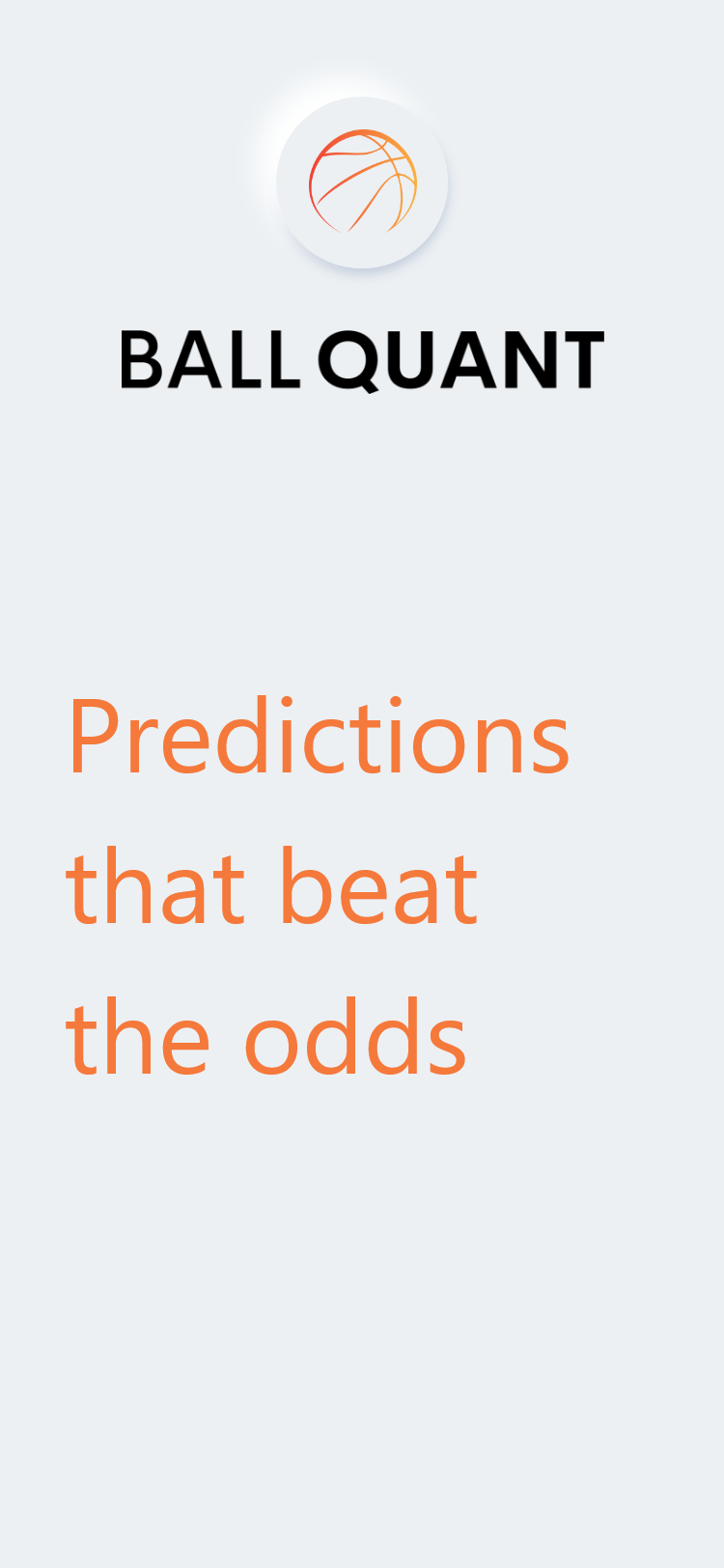
I threw in a redesign of Ballquant's website Log In / Landing page as a sign of good will.
On the left is the old version, and on the right is the new version.
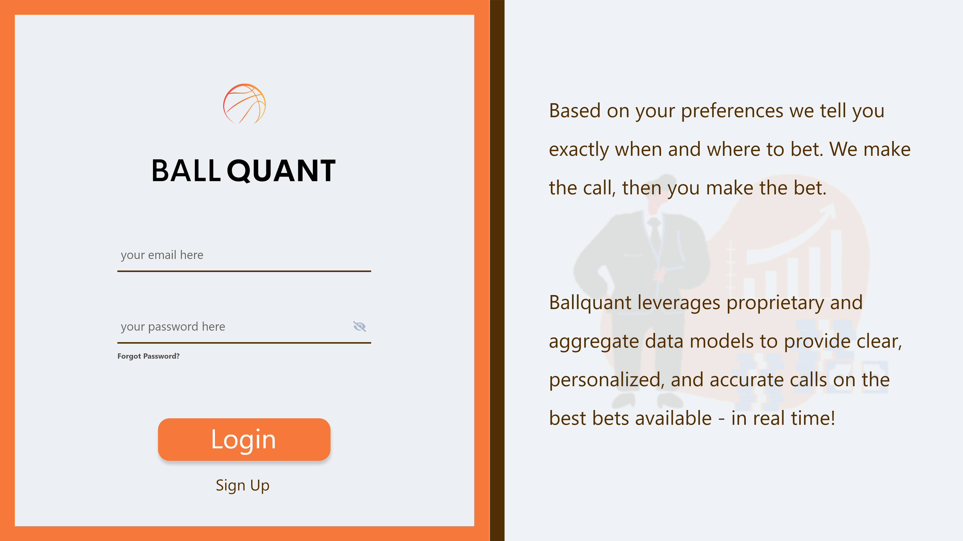
In congruence with this new design the rest of the website would have had simple information with
CTAs on the left portion of the screen, and busier information with details on the right portion of the screen.
Unfortunately, developing a desktop website was not an option with the client's budget at the time of this project.
Reflection

The client opted to use the provided information designs and adapt to a neighbouring medium.
An operating system desktop notification was created to work in tandem with the successful predictions.
At this point the client agreed that they had received what they had paid for and no longer required my services.
Looking Back
If I had more time to do work I would continue development on the website design.
Splitting the screen into halves that house different functions is a concept I have confidence in.
I would have liked to create the mobile phone's system notification, and build digestible, valuable copy.
If I could change something I would have made sure to request time to do post-launch evaluation on the product.

Thank you for reading. I appreciate your time.