Bringbud
High content volume shopping simplified for a company that lacked branding and a mobile app.
Bringbud asked to see what a payment
process might look like on a mobile app.
I showed them what a shopping process and a
payment process might look like for their users.

I worked on this project as a solo designer. All the works are my creation.
I spoke to a co-owner of the company and determined that there
was no clear company mission. This company was making
profits, but their branding was unrefined and it lacked
focus. Bringbud did not advertise what their
strengths were and what set them apart
from the competition.
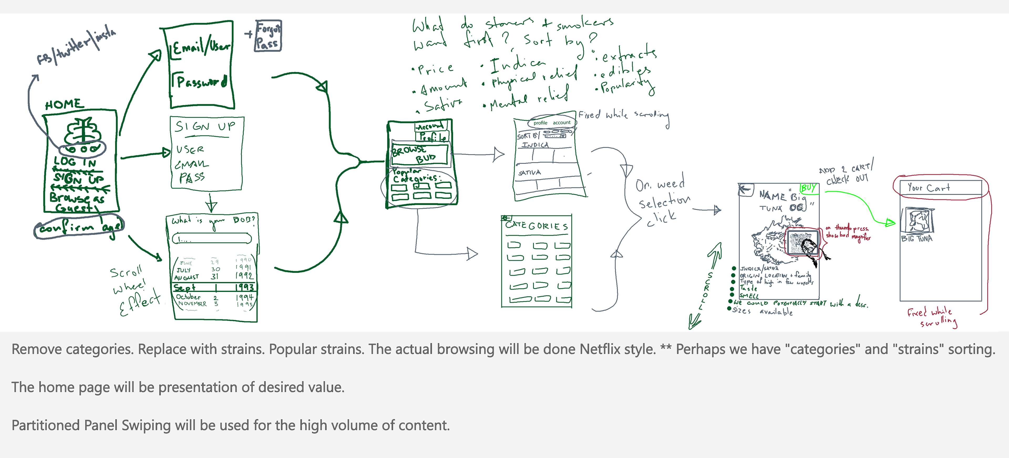
Cultivating Ideas
I did rough site-mapping in collaboration
with one of the co-owners to help gauge
expectations. There wasn't a lot of
structure or content to work with.

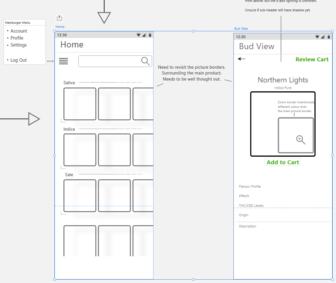
I produced low fidelity wireframes for screens
surrounding the shopping process. These
initials steps provided context for the
shopping experience.
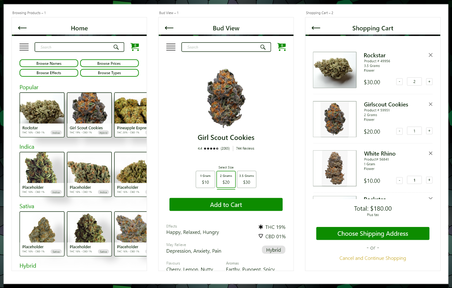
Below is a low fidelity wireframe example of what browsing
would look like. Since there are so many products a high content
volume method of browsing such as partitioned tile scrolling is appropriate.
Bud View is an idea that surfaced
after I interviewed 15 people who
regularly ordered marijuana on
websites and mobile apps.
Users loved the option of zooming
in to see the bud up close. This
affordance fostered trust.

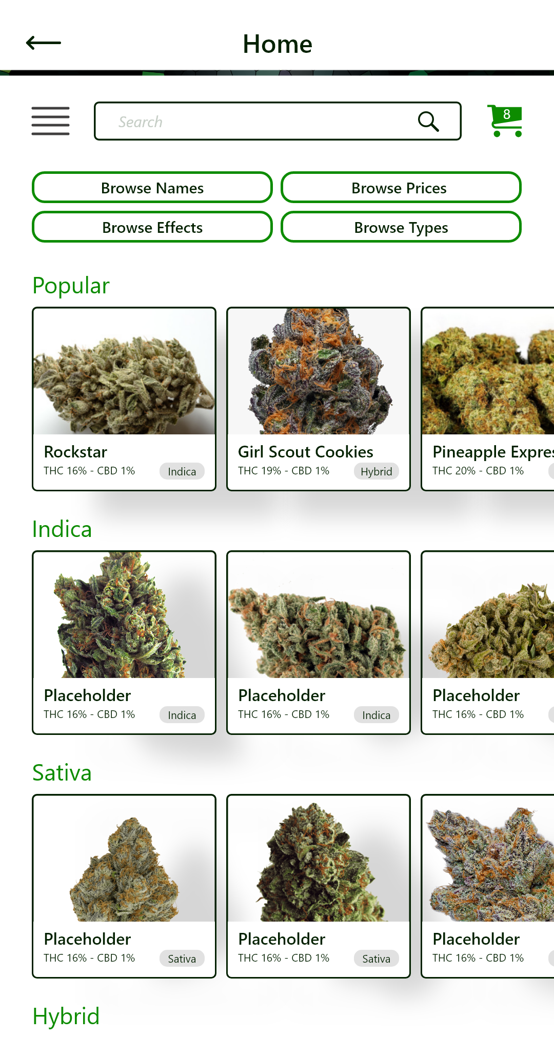
Navigating the Landscape
Through interviews I uncovered what users wished
they could sort by, and how they might easily filter their
results. That, coupled with the choice of partitioned
tile scrolling for high content volume, eventually gave
birth to the Bringbud home page.
An interesting debate here was whether or not to show tile content
outside of the grid alignment margin while scrolling sideways.
The "Indica" section is shown to be outside of it, while the
"Sativa" section is shown to be inside of it.
After asking several users I interpreted data to find that:
Allowing the photo to exist outside the margin does
not take any value away from users, and it potentially provides
additional findability and accessibility for those with larger screens.

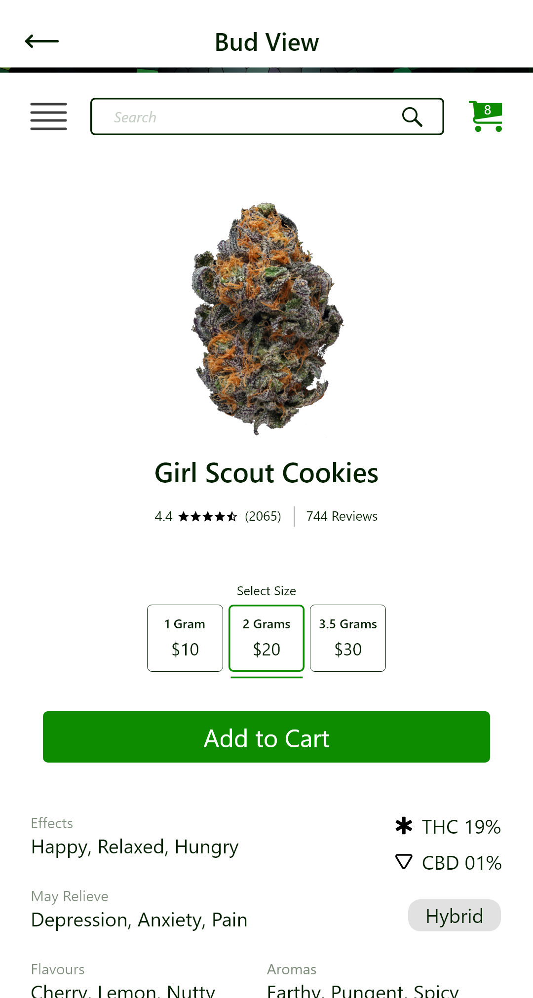
The product visual, name, and rating
were given a lot of spatial weight.
The option to add the product to the cart
is available instantly and is placed just
under the amount chosen. This allows a
seamless buy process for those who are
not interested in reading details.
That being said, the most sought after
information when browsing strains is
still visible without the need to scroll.
We wanted a clean looking shopping
cart with only the minimum amount
of information possible displayed.
The bottom button layout was inspired
by Amazon and their flexible option to
continue adding items to the cart.

Below we have Shipping and Payment screens.
The difference in margins and colour signify a change in task and pace.

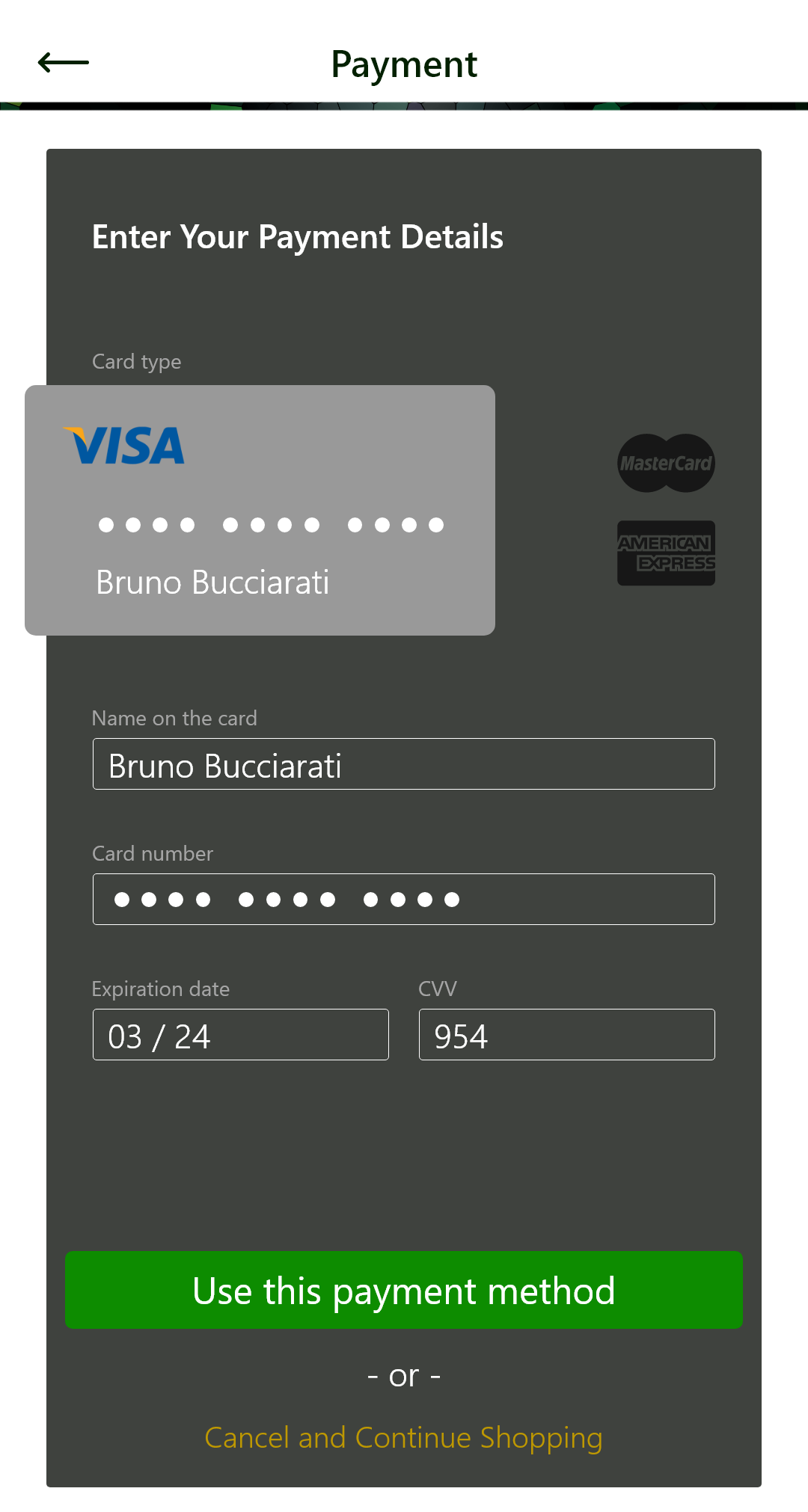
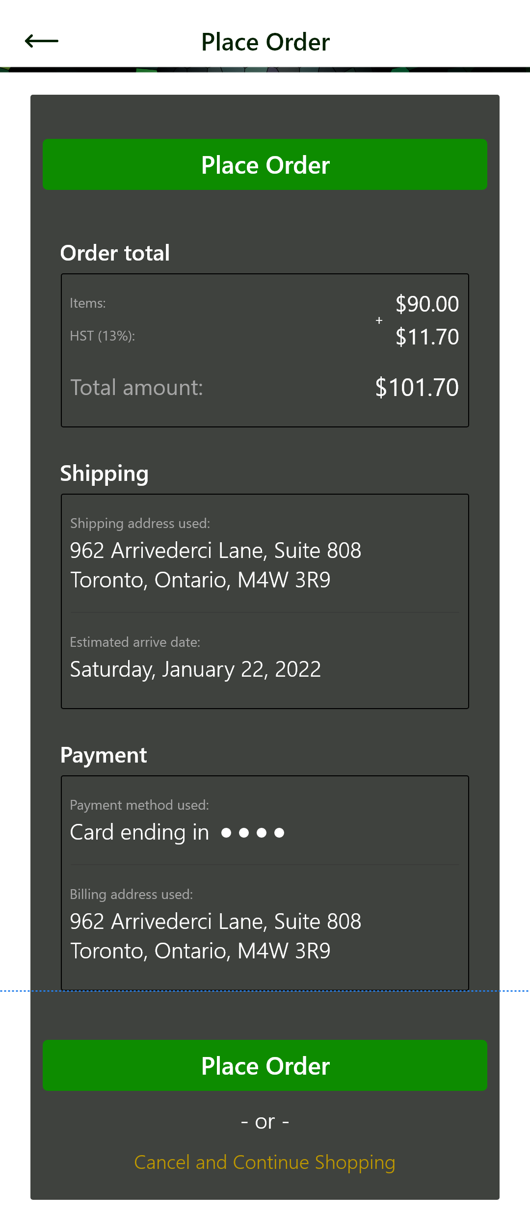
The blue line above represents the bottom of the viewport.
We have the button at the top to allow users to place the order without having to review the
information if they choose not to. They can also place the order at the bottom after reviewing.

Finalizing Flow
Below we have short videos that display the flow of the screens.
Please note that the brightness levels displayed are not representative of the actual product.

Just For Fun
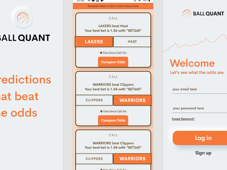
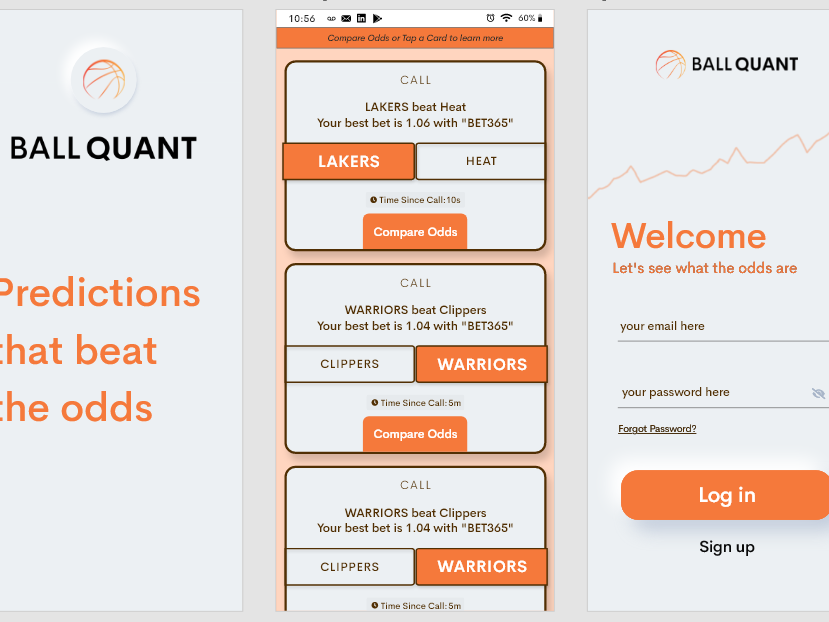
I threw in a redesign for one of their Instagram advertisements.


The original is on the left. My provided revamp is on the right.
While their initial advertisement had decent readability, it failed to
showcase the benefits of the service. The revamp allowed users
to clearly see the value that Bringbud is able to deliver.
Thank you for reading. I appreciate your time.